Visual Identity and Information Design: SHINE
In our modern society, more and more data is becoming available through technological advances like sensor technology, social media and smartphones. This data can concern a wide variety of aspects of our society, for example environment data like air quality, wind direction, temperature and rainfall, or data about cities like traffic density and parking availability.
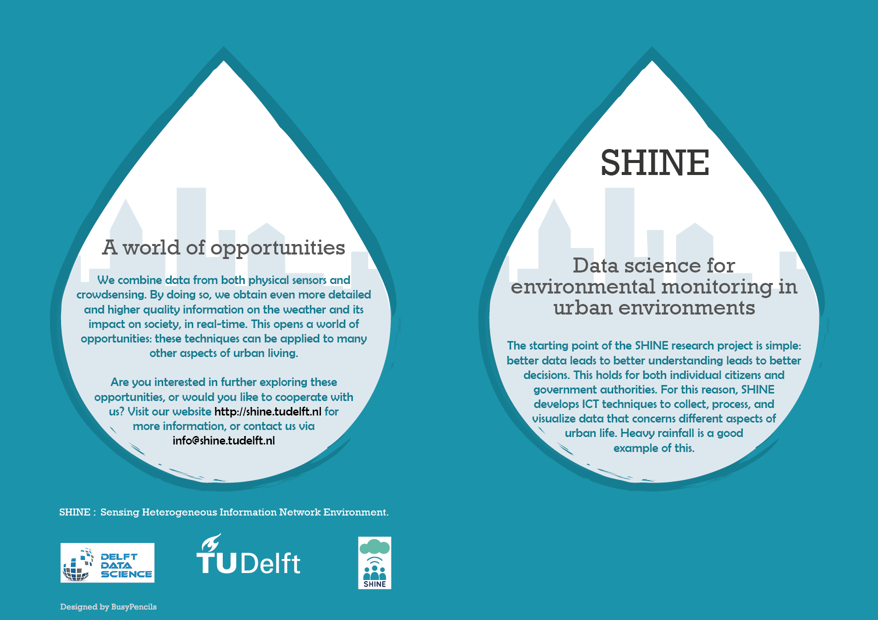
SHINE which stands for Sensing Heterogeneous Information Network Environment, is the flagship project of Delft Institute for Research on ICT ( DIRECT).The starting point of the SHINE research project is simple: better data leads to better understanding leads to better decisions. This holds for both individual citizens and government authorities. For this reason, SHINE develops ICT techniques to collect, process, and visualize data that concerns different aspects of urban life.
BusyPencils have been working for and with the SHINE project team to create a impressionable visual identity and communication strategy for the project. To be able to reach and connect better with their target audience, a logotype and an information flyer was designed as the first part of the communication strategy. The next steps will include more efficient means of communication on the web and social media.
The Visual Identity development
The BusyPencils team was provided with a number of keywords and a basic idea of what the project was about. There were a lot of them to choose from: rain, extreme rainfall, sensor, umbrella, city, rotterdam skyline, weather station, urbanization, climate change, flooding, community-based sensing, social media, weather app, social sensing, citizen science, storm, bicycle, car, clouds, snow.
Based on these keywords, a few preliminary sketches were made. They were presented and discussed with the project team.
![]()
The discussion led to a better understanding of the main message which had to be conveyed through the visual identity. During the development process, the most important aspects of the project emerged which had to be emphasized by the visual identity.
![]()
![]()
![]()
Since the first sketches were done in black and white to understand the forms, the next iterations also presented the usage of colours. A number of variations in the different chosen concepts were created using different color stories, in accordance with the TUDelft style guide. Eventually, after a discussion which touched on aspects of space, visibility and vibrance of colors, a final visual identity was chosen. The final identity had four major elements:
![]()
A cloud on the top, which represented the natural phenomenon of rain and the digital data cloud which is created by the users of the internet. Upward rising waves which represented the data which is being accumulated through physical sensors as well as users. Social sensing was represented by small human icons which linked themselves together to send data to the cloud. The last element was the typeface of SHINE, which identifies the project.
The Information brochure
Another important element of the communication strategy was to be able to reach the target audience with important information regarding the project in a visually appealing and succinct manner. The goal was to create a teaser which arises curiosity in the reader about SHINE.It was decided to shape this information element as a flyer which could be printed as well as shared digitally. It would include explanatory visuals and the scientific research concepts would be described in an easily comprehensible manner. Different aspects and the modules of the project also had to be illustrated. BusyPencils created a few initial concepts for the information design and layout with visual cues.
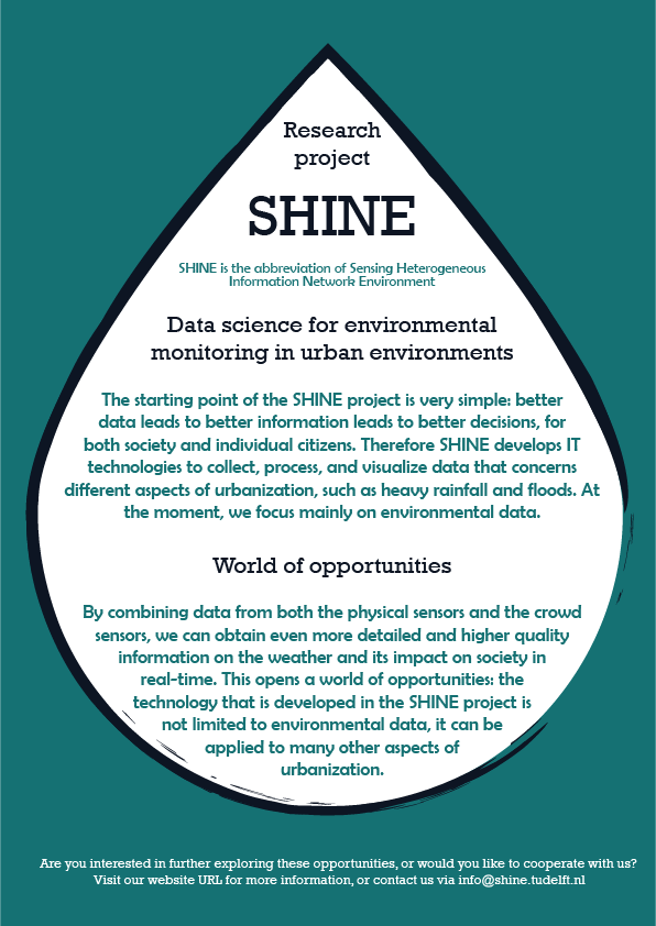
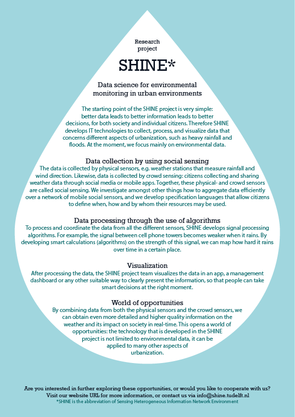
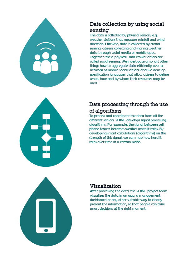
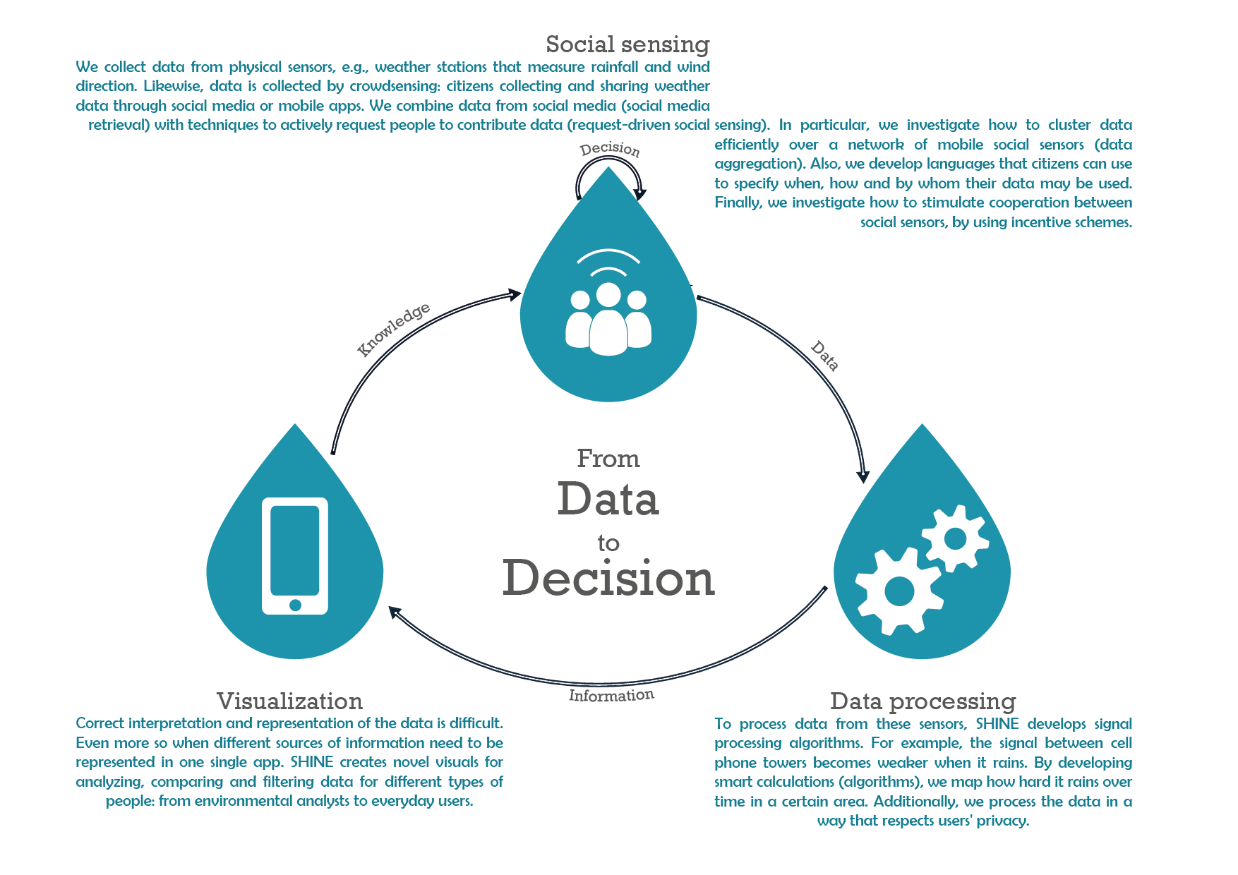
During the design process,the information was continuously refined and edited to be able to present the most important and unique aspects of the project. The format of the flyer was chosen to be a folded A4. The final design had an element of the urban environment as well as one for the weather/rainfall, along with the introduction and the aim of the project on the cover. The inner fold of the flyer had a small information graphic revealing the entire process of SHINE project :from data to decision making.
Leave a Reply
You must be logged in to post a comment.