Infographic: Urban Mobility in India
Using data to tell the story of how people live and move in urban India.
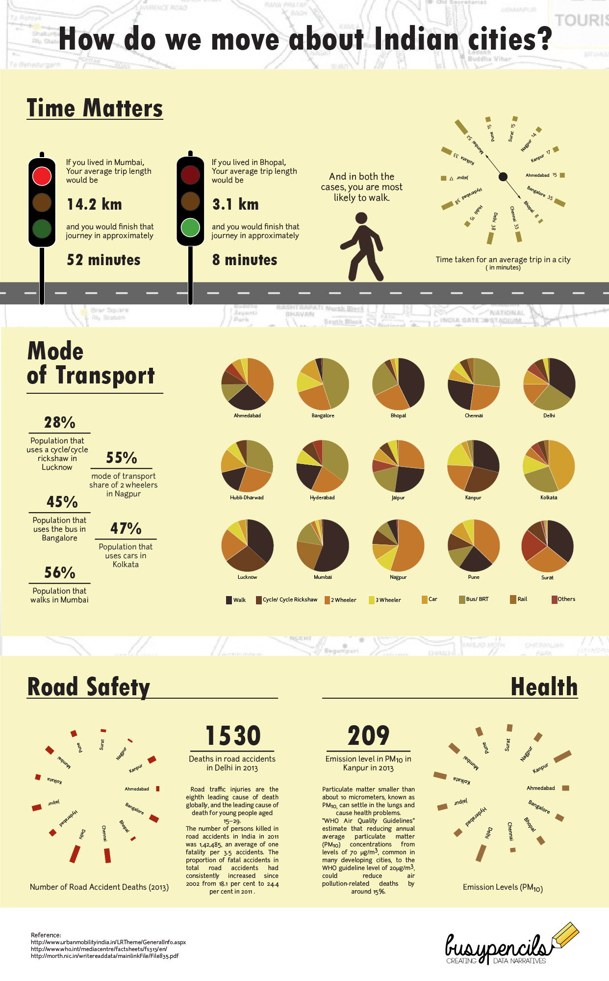
India just made it to the Mars orbit! But what about shorter trips closer to home? How do people move about Indian cities? From home to work, and from work to play? How much are they traveling? Who uses the roads, buses, and trains? Who walks and when do they walk? How do they make these choices? And how do these choices impact their health and economy?
The Institute of Urban Transport in India had launched a Data Visualization Challenge at UMI 2014 with support from EMBARQ India. The Challenge invited urban planners, designers, data scientists, and civil society to use a urban mobility data set collected from 15 different cities in India and to create meaningful visualizations that answered the question: How do we move about Indian cities?
How do we move about Indian cities?
BusyPencils analysed the data set and had some interesting insights to share about urban mobility. We sent our visual story for the visualization challenge and were chosen among the top 15 to be displayed at the Urban Mobility India conference held in Delhi from 25th- 28th November 2014.
Here is a brief description of our process of data analysis and visualization.
Focus
Our visualization focuses on the most important aspects of urban mobility and how it impacts lives. Since time is often equated to money, we calculated time taken for an average trip across a city and made it the leading point of our story. Some of the perils of commuting in cities involve road accidents and health issues related to air pollution. The emission levels in fifteen cities across India and road accident fatalities give us some alarming insights.
Data
From the provided data set, we used the data which indicates:
• Modes of Transport(Mode share)
• Average trip length,
• Average journey speed,
• Number of Deaths in road accidents,
• Emission levels
Besides this numerical data, we thought it was important to elaborate on context of terms like PM10, which is not so well-known. We researched for the permitted/safe levels decreed across different nations and presented some insights from a WHO report. Some more information about road accidents was included with the help of a Ministry of Road transport report and the trends which are presented added more context to our visualization.
Leave a Reply
You must be logged in to post a comment.